We’ve come a long way. 25 years ago, a network engineer had…


THWACKcamp is a free, annual, two-day digital IT learning event brought to you by SolarWinds, featuring expert speakers, interactive sessions, prizes, and more. For over ten years, thousands of tech…

After 15 years working on SQL Server and believing the world revolved around databases, I came to SolarWinds where I could learn more about operational technology and its role in…

Get a peek behind the scenes of THWACKcamp, the free virtual learning event for SolarWinds customers. Hosts Chrystal Taylor and Sean Sebring talk to THWACKcamp Executive Producer Matt Murray about…

Balancing growth and performance optimization is a constant tension in all aspects of business. This is particularly true in DevOps, where there’s a drive to release more features faster to…
We’ve come a long way. 25 years ago, a network engineer had an idea. The tools he used to solve IT problems weren’t as simple or effective as he needed—and…

Technology investments in today’s digital economy are crucial in achieving your business goals and gaining a competitive edge. As business strategies evolve and technology advances, IT environments are becoming increasingly…

Observability has emerged as a distinct approach within the broader scope of IT management, enabling organizations to gain valuable insights into their complex IT ecosystems. By collecting and analyzing data…
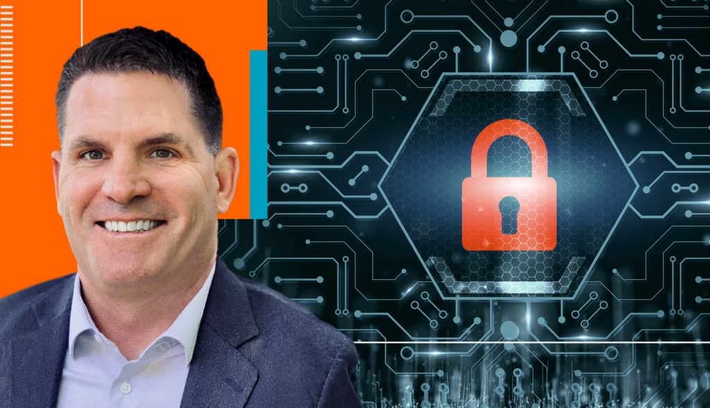
SolarWinds submitted its self-attestation in alignment with CISA’s and OMB’s requirements on March 20, 2024, becoming the first software provider to attest to meeting these requirements for federal government customers…

Your insights matter to us. As the IT landscape continues to evolve, we want to understand your challenges, aspirations, and priorities. Please take just 10 minutes to complete our census…
In this conversation, hosts Sean Sebring and Chrystal Taylor talk with Derek Daly, Principal AIOps Product Manager at SolarWinds. He discusses his career journey and the role of AI and…


